Amira type family
The Font Bureau, Inc., Boston, Massachusetts, 2003
Description
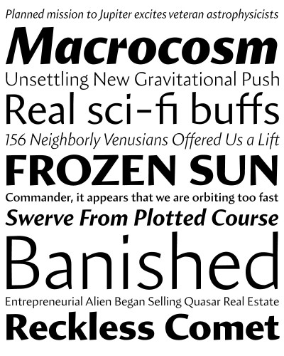
The cross between calligraphy and sans serif is rare, inhabiting territory between Hermann Zapf’s Optima, classical sans structure with a calligraphic spirit, and Warren Chappell’s Lydian, classical calligraphy without serifs. Cyrus Highsmith claims adventurous new ground with Amira, a letterform that pops from the page with an angled vitality that both welcomes and surprises readers with bright new rhythms and texture.
The humanist sans serif is a difficult typographic conundrum that has been around for a long time. Few designers have tackled it, which attracted Highsmith to it. Conservative typographers like D. B. Updike and Bruce Rogers found all sans serifs clumsy and difficult to read. Highsmith disagreed with their purist disdain, and was intrigued by the idea of a hybrid sans serif/roman type. With the present popularity of mono-weight and geometric sans serifs, he wanted to add something different.
Danilo Black used Amira in its redesign of Natural Health magazine. Christian Schwartz and Roger Black were immediately drawn to it. Schwartz finds that “Amira adds a certain freshness that I can’t really describe. I think that it may be the best thing that Highsmith has ever drawn, organic but controlled, subtle, and the italic is fantastic.” Black says simply, “It’s the new Lydian!”
Juror Notes
I know how hard this is to do. We are always looking for a new san-serif that has legs. The fact that it is a family makes the accomplishment impressive. It has a slight edge but doesn’t take it too far.
Credits
- Design firm
- The Font Bureau, Inc.
- Art director
- Roger Black
- Designer
- Cyrus Highsmith
- Editor
- Jill Pichotta
- Manufacturer
- The Font Bureau, Inc.