


Safeway Fruit-Flavored Sodas
Anthem Worldwide, San Francisco, California, 2006
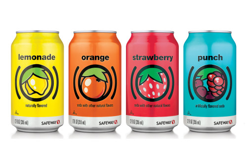
Description
As part of Safeway’s new corporate-brands program, Anthem created a strategic point of difference on shelf for their private-label fruit sodas. Drawing from a more progressive European design influence, Anthem’s new system removes all the extra layers and boils each flavor down to its essence—it says only what it is and doesn’t claim to be anything else. Each can’s artwork is iconic and accentuates the specific characteristics that consumers associate most with each fruit. In addition to framing the artwork, the parentheses give focus to the simple flavor and subtly insert a succinct explanation of the can’s contents.
The product’s form factor was carefully considered in the packaging development as well. By keeping the design simple, the usual color limitations were avoided; crisp, recognizable imagery was the result. Like their contents, the cans are refreshing, and their unified, consistent look offers an eye-catching presence in the soda aisle.
Juror Notes
“So refreshing to see no drop shadows, computer effects or other techie motifs on these classic sodas.”
“Gives the ‘pop’ to soda pop—bright, clean, very kid-friendly, simple, direct, tasty (if you’re into sweet stuff).”
Credits
- Design firm
- Anthem Worldwide
- Creative director
- Ron Vandenberg
- Art director
- Brian Lovell
- Designer/illustrator
- Michael D. Johnson
- Production director
- Chris Toner
- Production artist
- Mary Mazonson
- Project manager
- Catherine Rude
- Client
- Safeway Inc.