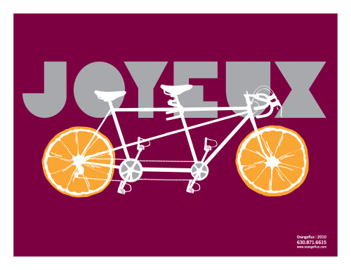
Joyeux
Orangeflux Design, Wheaton, Illinois, 2010
Description
Project brief: Joyeux is the first in a series of handmade silk-screen posters that were sent to current and prospective clients. Our objective was to create a collectible series of silk-screen posters that would act as a marketing tool for our design studio. This proved to be an effective campaign on several levels. A few existing clients loved the quality of the art and silk-screen printing and asked us to develop similar posters for them. It also heightened client awareness of Orangeflux, resulting in inquiries about new projects. Prospective clients have responded positively as well.
Approach: The concept was to produce a creatively fun piece that would help us celebrate and announce our 14th year in business. Our passion for design started with creating small-run design collectibles. We wanted to return to those ideals and create something by hand. The concept of Joyeux was to abstractly illustrate our company and aesthetic in the form of a collectible print. The tandem bike represents the two owners of Orangeflux, Matt Fey and Kristina Meyer. They were the creative directors for this project. The bike also represents the creative journey we have been on over the course of the past 14 years. The title of the poster reflects the fact that we are celebrating our 14th anniversary. It also represents the happiness we find through design. The poster is a three-color silk-screen with a run of 50. These were mailed and given away in person to current and prospective clients.
Effectiveness: The posters were successful in reinforcing the Orangeflux brand to current clients and introducing us to prospective clients. The piece was memorable and conveyed a positive message. From the return-on-investment perspective, the campaign has paid for itself many times over. A few existing clients liked the quality and playfulness of the silk-screen posters and had us work on similar posters for their events. The distribution of the posters created a great opportunity to reconnect with our existing clients. We also used the poster in a Facebook campaign to acquire additional followers.
The posters were intended to be pieces that recipients would keep rather than the typical marketing pieces that would get thrown in the trash soon after receipt. In this way, we would like to think that it contributed more to the beautification of the environment than to the trash heaps or recycling bins.
If users were to hang this in their workplace or home, it could have a further impact on the culture at large. We believe the handcrafted quality of the silk-screen process is one to be preserved and shared. Ideally this poster would help to educate the public about the beauty of this technique.
Juror Notes
Fresh and juicy.
Credits
- Design firm
- Orangeflux Design, Wheaton, Illinois
- Creative directors
- Matt Fey, Kris Meyer
- Designers
- Matt Fey, Kris Meyer

