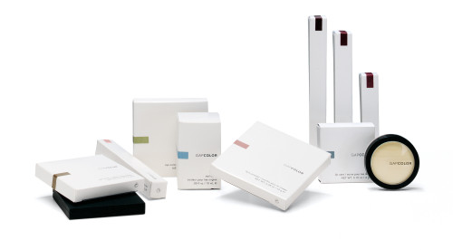
GapColor Cosmetic Line packaging
Gap Inc., San Francisco, California, 2001
Description
Our aim for the new Gap cosmetics collection was to create a design that represents the clean, modern essence of the brand. The fresh white packaging sets off colored labels that indicate product color at a glance. We organized the information carefully to minimize the visual impact of all legally required type.
Juror Notes
“It makes the product seem more expensive than it is. It’s very clear with color. It compares well with other cosmetics.”
“This feels more Gap to me than the flowery stuff the company was doing for a while. From a cost perspective, it’s a brilliant idea. The sticker is a good way of communicating the metallic nature of the product. For this price point, it’s amazing. I’d be really happy to take this out of my purse.”
Collections:
AIGA 365: 23 (2002)
Repository:
Denver Art Museum
Discipline:
Package design
Format:
Package
Credits
- Design firm
- Gap Inc.
- Design director
- Jennifer Durrant
- Designer
- Matthew Fadness
- Production artists
- Matthew Fadness, Keith Teleki
- Structural designer
- Ted Wang
- Printer
- Packaging Spectrum
- Manufacturer
- HCT
- Typeface
- Akzidenz Grotesk
- Client
- Gap Inc.
Loading...
Loading...