


Election maps, The New York Times
The New York Times, New York, New York, 2004
Description
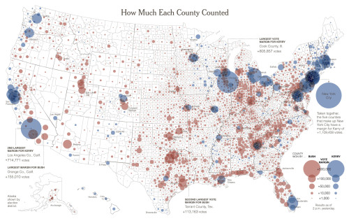
After the 2000 election, the red and blue map became part of the nation’s visual vocabulary. The Times was one of a few news organizations that produced a county-by-county map showing how the nation voted. To mitigate the visual distortion created if each county was shaded a solid red or blue, we varied the intensity of the colors on the map according to the strength of the vote earned by the winning candidate in each county. The resulting map not only showed who won where, but also revealed the difference between areas of hard-core support for a candidate and areas that were more evenly divided. But this technique still had its problems—it put a disproportionately large emphasis on sparsely populated areas, while understating the importance of urban areas. In the run-up to the 2004 election, we wanted to address this problem, so we tried out a number of different map forms. The one that we felt was the most accurate visual representation of the vote was one in which the winning margin of votes is charted as a circle centered in each county. We also tried another technique, called dasymetric mapping, in which we subtracted areas of the map that were mostly unpopulated. Ultimately we decided to run a series of maps, including these two, to allow readers to see the results through different lenses.
Credits
- Design firm
- The New York Times
- Graphics
- Steve Duenes
- Director
- Steve Duenes
- Designers
- Matthew Ericson, William McNulty, Archie Tse
- Pages
- Newsprint
- Client
- The New York Times