Typographia Polyglotta
Association Typographique Internationale, 1997
Description
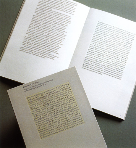
In designing the layout of the book, priority was given to presenting the language exhibits, which constitute the centerpiece of this study. Decisions on the typographic formatting of the language exhibits were made first: the typography of the text was both coordinated to it and subordinated to it. Where the language extracts were set in a justified serif font, black on white, the text was set in an unjustified sans serif, dark gray on light gray. Thus, the light gray exhibit pages ended up sandwiched between the white pages of the front and back matter. The page layout of the book (the column measure, the margins, and the unit grid in general) is built around the typographic parameters of the language exhibits. A square “window” in the tinted background is sized to the length of the “control” language exhibit (all English); it provides for a quick visual reference to the extent of a given language sample.
Credits
- Design firm
- Association Typographique Internationale
- Graphic designer
- Maxim Zhukov
- Typefaces
- Frutiger 57, Various
- Printer
- The Stinehour Press
- Paper
- 80# Mohawk Vellum Text, Warm White
- Publisher
- Association Typographique Internationale