

Johnny’s Painting Identity System
Lowe, New York, New York, 2003
Description
Johnny's Painting, a commercial painting company, asked us to create an identity that communicated their professional, personal touch that is always delivered at a fair price, an attribute that clearly separated them from their competitors.
We needed a fresh approach in forming the foundation for the identity. The execution of “personal touch” has been done to death.
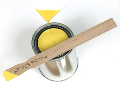
We found the approach: dip in paint every item Johnny’s Painting used in communication and every item they used in performing their job. We also told the client that the execution of the identity should be their responsibility. This not only exemplified the personal touch, it also demonstrated that Johnny’s Painting had a low-budget execution for their identity.
Every prospective client that saw the Johnny’s Painting calling card understood that it had been personally dipped in paint. They would comment that it looked very professional but not expensive. The concept for the identity delivers on both fronts: personal care and budget savvy. The client is extremely happy with the results they are getting.
All items for the identity were simply preprinted one color (black) at very little expense. We then demonstrated the dipping technique to the painters’ helpers. Because the client dips the paint with existing paint they have warehoused from previous projects, the cost of implementing the identity is minimal.
Credits
- Design firm
- Lowe
- Creative director
- Greg Crossley
- Designer
- Greg Crossley
- Photographer
- John Blackford
- Production director
- Brian Logan
- Project manager
- John Oliphant
- Printer
- Print International
- Paper
- Neenah Classic Crest Bright White
- Typeface
- ITC American Typewriter
- Client
- Johnny’s Painting