


Lattitude re-brand
OPX, London, England, 2008
Description
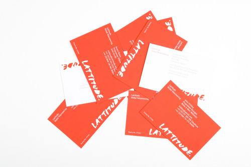
The re-branding of GAP Activity Projects to Lattitude Global Volunteering covered a number of touch points, but the idea behind the look and feel was to communicate the passion felt by the volunteers themselves. The use of red was emotive and the bespoke typeface gave the identity a handwriting feel, which reflected the personal contribution volunteers make to the communities where they are placed. The effect is expressive, removing the brand from the sphere of other generic gap-year companies and appealing to an audience who wants to immerse themselves in a culture and make a real difference, rather than observing from the safe distance that tourism usually offers.
There were budgetary restrictions due to the nature of the industry (a charity could not spend a lot on its communications materials), but simplicity felt right anyway. Decisions on design were steered not only by the company itself but also by volunteers past and present. It was tested on its intended audience and informed by their experiences; it was a product of something real and felt. As a result, Lattitude emerged as an organization with attitude and heart.
Juror Notes
Really simple; unmistakable on the outside; very well detailed on the inside. Perfect for the audience.
Credits
- Design firm
- OPX
- Art director
- David Bennett
- Creative director
- Simon Goodall
- Designers
- Ivan Mato, Michael Weber
- Printer
- Team Impression
- Printing method
- Lithographic
- Binder
- Team Impression
- Binding method
- Perfect
- Papers
- Robert Horne, Revive 100
- Typeface
- Lattitude Sans (bespoke)
- Client
- Lattitude Global Volunteering