


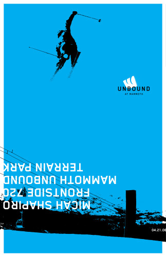
Mammoth “Unbound”
Hornall Anderson, Seattle, Washington, 2008
Description
Come as you are! This casual, laid-back message represents the Mammoth mantra, emphasizing the unconventional Southern Californian lifestyle and reflecting their authentic personality. The initial creative scope focused solely on a visual system, but the project quickly turned to re-branding the mountain to better reflect who they wanted to be, capturing the spirit of California and what Mammoth represents: a unique offering of a surf-culture environment at the mountains and an international-destination ski area.
Unbound, the Mammoth snowboard park—a series of 77 runs—has a radical, loose and expressive look and feel. The Mammoth logo is used as a post-applied element, like a spray—painted image turned upside down to be more freestyle—a little reminiscent of a U. To give Unbound its own visual system, the Mammoth logo is flipped. Unbound is the subculture at Mammoth, and we needed to link the two while giving the Unbound people a way to express themselves.
Juror Notes
We love the upside—down type and imagine the audience really identifies with it.
Credits
- Design firm
- Hornall Anderson
- Creative directors
- Jack Anderson, David Bates
- Designers
- David Bates, Javas Lehn
- Client
- Mammoth Resort