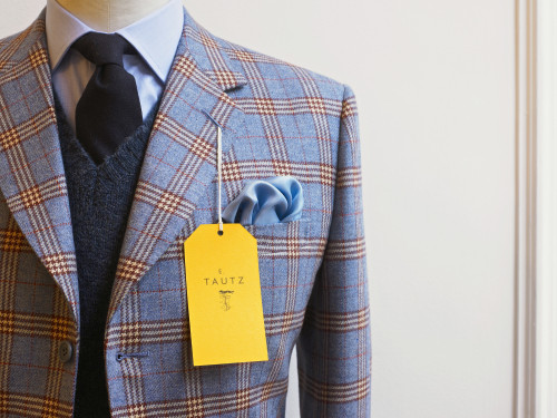
E. Tautz
Moving Brands, London, England, 2008
Description
Our client approached us with the challenge of creating the identity for a British brand steeped in heritage as a military outfitter, one that could thrive in today’s modern world. E. Tautz is from the stable of Norton & Sons, a Savile Row tailor, and takes the form of a luxury, ready—to-wear range of menswear.
With such a rich history, our communications objective was to tell the story of “a wardrobe for a life less ordinary.” The identity we created is clean and modern, with a hint of utility to reflect its military provenance. We mixed muted, natural blacks, grays and copper with a very rich, bright yellow. The yellow is hugely identifiable and unusual, and it features in many of the design expressions. To retain the Savile Row background, we used high—quality authentic materials in everything we created—heavy uncoated stocks, natural buckram, copper foil and, of course, parcel string.
Juror Notes
Requires a second look, and then it is spectacular.
Credits
- Design firm
- Moving Brands
- Creative director
- Mat Heinl
- Designer
- Mark Thompson
- Project manager
- Paul Martin
- Photographer
- Adam Laycock
- Client
- Norton & Sons