

Jme
Pearlfisher, London, England, 2009
Description
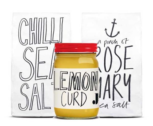
Jme is an eclectic collection of products inspired by Jaime Oliver’s relaxed approach to eating, entertaining and enjoying life. The distinctive logo and corporate identity has a fresh, emotive and considered feel. It is collaborative and adaptable, allowing the Jme brand to exist in a fluid and natural way.
The striking original packaging for this eclectic lifestyle range reflects the specific function of each product it contains, and uses the bold Jme logo as a way of holding the collection together. In addition, where possible all packaging is 100-percent recyclable or is recycled.
Juror Notes
Simply captures the essence of the client.
Collections:
AIGA 365: 31 (2010)
Repository:
Denver Art Museum
Discipline:
Package design
Credits
- Design firm
- Pearlfisher
- Creative directors
- Natalie Chung, Jonathan Ford
- Designer
- Sarah Pidgeon
- Writer
- Sylvie Saunders
- Client
- Jamie Oliver
Loading...
Loading...