Mohawk Satin and Vellum “Beauty in Utility” Promotion
M/W, New York, New York, 1998
Description
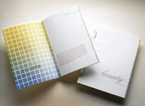
This piece takes a look at the simple things that are ubiquitous in our lives and asks us to consider them in a new light. The photography is deliberate, simple, and honest. These are not objects made beautiful by abstraction or styling techniques; rather, their intrinsic grace is laid bare. Even the black shape surrounding the light bulb comes from a utilitarian origin—to reflect a dark shadow and define the edge during photography. Sewing patterns, cardboard box graphics, and a topographic map are included as typographic parallels. The printer’s color bars embedded in the gutter can be used to tell which photos are duotones, tritones, or four-color process. Industrial box staples and perforated scores are everyday finishing techniques that are actually quite beautiful. The die cut to the binding area makes decorative use of an area of the brochure that is usually unseen.
Credits
- Design firm
- M/W
- Art director
- Allison Muench Williams
- Photographer
- Hans Gissinger
- Writer
- Laura Silverman
- Printer
- Active Graphics
- Paper
- Mohawk Satin and Vellum
- Client
- Mohawk Paper Mills