

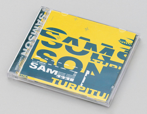
Samson: Turpitude
Stereotype, New York, New York, 2000
Description
The band wanted to convey the meaning of turpitude without using any literal imagery. We ignored photography and illustration and solely used typography. We tried to convey a fractured and chaotic feel by randomly cutting up type and then piecing it back together. The design that went to press is exactly as we presented it to the band. We were all on the same page from the start. Basically we love the overall look and feel. It just seems to work for what we set out to do. It’s fun to get back to the basics of graphic design and experiment with type as form.
Collections:
Soundblast
Repository:
Denver Art Museum
Discipline:
Package design
Format:
Package, Album cover
Credits
- Design firm
- Stereotype
- Art director
- Mike Joyce
- Designers
- Mike Joyce, Andrew Taray
- Typeface
- Akzidenz Grotesk modified
- Printer
- Imprint
- Paper
- Finch Fine uncoated white
- Fabricator
- Imprint
- Publisher
- Pompello Music
- Client
- Pompello Records
Loading...
Loading...