


Greene Hills Food Co-op Logo
Base, Brooklyn, New York, 2009
Description
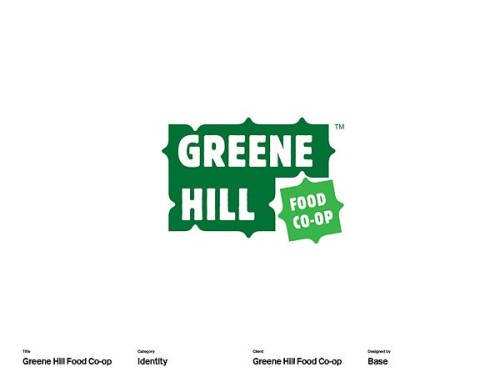
We used the co-op’s guiding principles as the foundation for the identity, pulling out key words: welcoming, community, affordable, diversity, eco-friendly, healthy, fresh. The identity design is based on the idea of coming together because a co-op is where neighbors, farmers, merchants and food come together to make quality organic, local food available at lower cost. To translate that idea visually, we referred to the way pieces of a puzzle fit together. But rather than using typical jigsaw puzzle shapes, we created five squares with interlocking nubs and divots that have a more abstract, plant-like, organic feel. These pieces are the building blocks for the identity and will be used to create all of the applications, much like all the parts of the community come together to create the co-op.
Juror Notes
It’s a great and appropriate modular identity. Working with existing logos can be tough, but I think I’d enjoy playing with this one.
Credits
- Design firm
- Base
- Designers
- Anna Simutis, Yoon Yoo
- Client
- Greene Hills Food Co-op