High Fidelity
Archie Ferguson Design, New York, New York, 1995
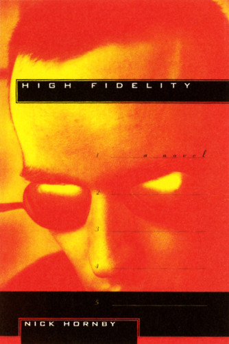
Description
My intention was to create a jacket that reflected the lively nature of the novel. The appealed graphically to its audience while having its own identity. I felt the jacket should illude to the writing in a non-specific way to create an atmosphere rather than be literal. The image also inadvertantly gives a quirky identity to the main charactor. This seemed to be an opportunity to do something somewhat non-traditional both icono-graphically and typographically, while still being legible and accessible. The jacket looks as it should. Very hip but not tragically hip by trying too hard. I’ve managed to use traditional elements (font, imagery, color, etc.) to create an original and current package while maintaining a sense of higher style. Furthering my belief that one doesn’t have to use undecipherable imagery and ugly distorted gooky unreadable type to be “fresh”.
Credits
- Design firm
- Archie Ferguson Design
- Designer
- Archie Ferguson
- Cover photographer
- Swavo Zulawinski
- Author
- Nick Horney
- Publisher/client
- Alfred A. Knopf Publishing Inc.