C2O Color to Order Packaging
Nordstrom In-House, Seattle, Washington, 1996
Description
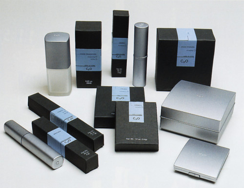
This pharmacy-inspired packaging for C20 Color to Order was designed to convey the intent of the product itself. The clean, brushed-metal containers are almost sterile-looking and were created to hold cosmetics that, like prescriptions, are made to order right at the counter specifically for the individual needs of each customer.
The blue label, which features a simple typeface versus graphics as its main design element, furthers this feel. Each label is customized with the name the customer selects for the shade that was created for her, as well as its formulation (oil or water-based, matte or sheer, etc.). The packaging is functional and also achieves the aesthetic objective of highlighting C2O’s key point of difference as a product that is completely and uniquely suited to each customer.
Credits
- Design firm
- Nordstrom In-House
- Creative director
- Cheryl Zahniser
- Graphic designer
- Åsa Sandlund
- Copywriter
- Gail Miller
- Typefaces
- Avenir, Gill Sans Condensed
- Printer
- FMC
- Papers
- Custom Board Stock, MacTac Starliner
- Client
- Nordstrom Corp.