Push
Alfred A. Knopf, New York, New York, 1996
Description
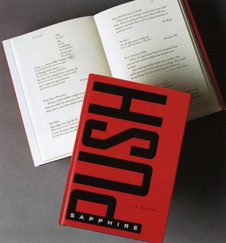
Given the vivid and rough content of the book and the stark and stylish jacket design, I wanted the design of the interior to be strong and unadorned. The trim size seemed small for such a strong topic. I chose an extra bold sans serif face, “pushed” the letters together, and made the title as large as I could, bleeding off all sides. The “H” on the right side of the title spread suggested a confined, limited space, which I used as the type area for the title page. The part titles followed in the same position as the running heads and folios did. The text is plain and the book within the book at the end is designed to look like the typewriter-produced document it was supposed to be. The black-on-black binding design echoes the glossy/matte design of the jacket and the plainness of the interior, with the title on the front again in the same off-center position as the inside titles. I enjoy working with type as a medium and like the way this title created a design format in itself.
Credits
- Design firm
- Alfred A. Knopf
- Art director/designer
- Virginia Tan
- Author
- Sapphire
- Typefaces
- Dogma Black, Janson Text, Prestige Elite
- Printer
- Berryville Graphics
- Paper
- Writers Offset #55
- Publisher/client
- Alfred A. Knopf