Packaging, Waitrose premium dried fruit
Turner Duckworth, Turner Duckworth, London, England, 2004
Description
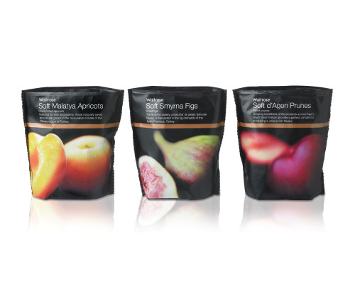
The Waitrose Dried Fruit brand had new lines added on a piecemeal basis over a number of years. A review of the range and observation of consumers shopping the brand highlighted the need to bring appetite appeal and premium cues to the range, underpinned with clarity and consistency. Our overall objective was to increase individual purchase weight by making it easier to shop.
Our solution targeted Waitrose’s core consumers (affluent health-aware professionals) with a design that uses evocative close-up photography of individual fruits in all their perfection, to emphasize the specially selected fruit variety.
Collections:
AIGA 365: 26 (2005)
Repository:
Denver Art Museum
Discipline:
Package design
Format:
Package
Credits
- Design firms
- Turner Duckworth, Turner Duckworth
- Creative directors
- Bruce Duckworth, David Turner
- Designer
- Christian Eager
- Photographer
- Steve Baxter
- Production artist
- Reuben James
- Printer
- Amcor Flexibles Europe
- Printing method
- Gravure
- Fabricator
- In Touch
- Manufacturer
- Waitrose
- Typeface
- Helvetica Light
- Client
- Waitrose Plc
Loading...
Loading...