


Moomah
Apartment One, Brooklyn, New York, 2009
Description
Moomah is a creative arts café for parents, children and friends in TriBeCa, New York. When we first met with Tracey Stewart, founder and president of Moomah, she expressed a desire for Moomah to be a space that encourages creativity and connection, where imagination is king, where we are inspired by our children and hope to inspire them and teach them that anything is possible. We worked to create a visual and written brand language that spoke to those ideals. We created three different variations of the M logo out of elements that represented each of the four core brand values: connect, create, discover and nourish—Moomah being a space to encourage parents, children and friends to connect, create, discover and nourish their relationships to one another, themselves and the world around them. Those values also speak to some of the many activities one can participate in when visiting Moomah.
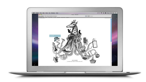
We also wanted to create a memorable and recognizable brand language without having to put a logo on all applications. We created custom application-specific illustrations filled with the wonder, magic and heart of Moomah and placed them above a dotted line and type to set the foundation. These illustrations and corresponding tag lines were conceptually developed for their specific applications (business cards, stationery, café menu, hot and cold cups, shopping bags, stickers, brochures, website, etc.).
Juror Notes
Great use of formal, repurposed illustrations that create the brand look, feel and concept. Great brand application across business and detail items.
Great color design approach.
Love the headlines.
Credits
- Design firm
- Apartment One
- Art directors
- Spencer Bagley, Liza Lowinger, Dean Nicastro
- Copywriters
- Christina Eliopoulos, Joanna Siegel
- Printer
- Green Earth Enterprises
- Client
- Tracey Stewart