Donut King Identity and Environment
Lorenc Design, Atlanta, Georgia, 1996
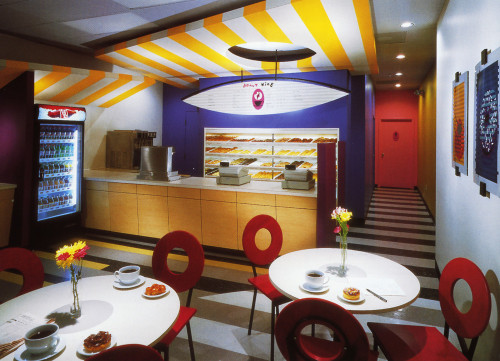
Description
The owner of six small breakfast spots located near public transportation tried to capture commuters with “down home” simplicity. The result was small, fluorescent-lit storefronts as devoid of life as a doughnut hole. Lorenc Design was invited to help restore their market appeal.
Lorenc Design, avoiding traditional fast-food associations, developed a design scheme that converted Donut King into a tour de force of doughnut culture in America, using ’60s-style typography and a cup ’n’ saucer logo for the identity. Customized interlocking patterns were developed for use on the floor tiles, poster graphics, and canopies, lending continuity to the six stores. Lorenc Design also designed a bistro “donut table,” “donut chair,” and “sunrise” cafe canopies over the serving area. Food graphics used on posters and etched glass windows in front of the bakery echo the floor and canopy patterns.
The design intent was to add humor and zest to the rush-hour breakfast. Like sprinkles on a frosted cruller, most of the experience is just for fun.
Credits
- Design firm
- Lorenc Design
- Creative director
- Jan Lorenc
- Project designer
- Chung Youl Yoo
- Graphic designer
- Rory Myers
- Designer
- Sook Lim
- Illustrator
- Rory Myers
- Photographer
- Rion Rizzo/Creative Sources Photography
- Architect
- Steve McCall
- Interior designer
- Janice McCall
- Fabricator
- Designers Workship Inc.
- Client
- Donut King