


The Style Manual, GQ special edition
Triboro Design, Brooklyn, 2010
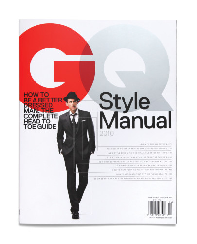
Description
Project brief: GQ asked us to art-direct a supplemental issue of their magazine. The Style Manual would be a “bookazine” with almost no advertising, a kind of catchall style bible full of advice and tips on how to be a sharply dressed man.
Approach: For the cover we wanted to separate this special edition from the standard GQ by making a scale shift, making the logo huge and the person small. To communicate the value and the content to the consumer, we had this annotated man convey the kinds of tips that were waiting inside. Each chapter of the Manual focused on a different part of the package: suits, ties, shirts, shoes, etc. We would break up chapters with vintage shots of kick-ass men looking great. For the inside of the Manual, we developed a grid that slices each spread into vertical segments of varying width. The rhythm created by the grid and the shifts of scale in the artwork guide the reader’s eye around each spread and helps maintain a sense of movement throughout the issue.
Effectiveness: Newsstand sales were excellent. Also, recognizing the value of the Manual, retailers bought thousands of copies for their sales associates as a handy reference.
Juror Notes
Sexy and useful. Has all of the elements of a magazine put together like a true guidebook. Step-by-step enticement.
Credits
- Design firm
- Triboro Design, Brooklyn
- Creative director
- Fred Woodward (GQ)
- Art directors
- David Heasty, Stefanie Weigler
- Editor
- Adam Rapaport (GQ)