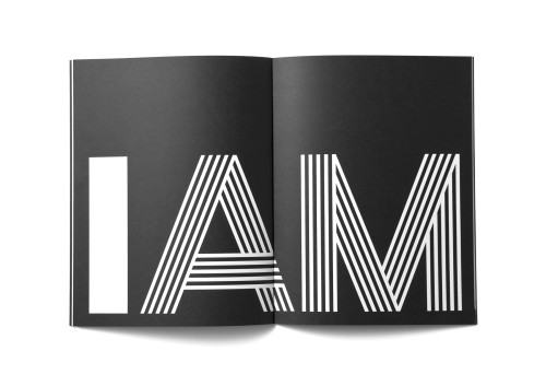
I AM
Alt Group, Auckland , Auckland, New Zealand, 2010
Description
Project brief: The Auckland Museum holds the world’s largest Maori and Pacific collection and is a natural history as well as a war memorial museum. Museums now compete for audiences with many other types of experiences that didn’t exist in the past—shopping malls, movies, digital games—as well as myriad other forms of entertainment—art galleries, sports and the great outdoors. The challenge was to develop a campaign identity and communications platform that both aligned the team internally and repositioned and reconnected the Museum with its external audiences.
Approach: The solution came from a fundamental questioning of what a museum is. This process highlighted the need to rethink the role of the organization and how it connected with people both within its building and beyond it. AM was developed as the campaign mark in conjunction with a brand voice that could operate in different modes. AM is an acronym for Auckland Museum. I AM is an introduction. I AM is an affirmation. It could make statements: I AM not what you think. It could pose questions: Who AM I? It could describe the role of the institution: I AM yesterday, I AM today, I AM tomorrow.
A pattern language was developed as part of the identity, referencing the visual traditions of Maori and Pacific carving and the neo-classical architecture of the building itself. A typographic language combined different typefaces with visual elements relating to the logo mark. A simple color palette of black and white was adopted, giving a high degree of flexibility to accommodate the requirements of exhibition and event communications. A photographic portraiture approach was developed, putting the people of Auckland at the center of communication.
The core identity elements were applied and extended across a broad range of internal and external communications, including brand books, collateral, exhibition and event campaigns, education programs, signage, print, online, radio and television advertising.
Effectiveness: The campaign identity has repositioned the Museum as a social hub and highlighted its relevance to different target audiences both inside and outside the organization itself. The identity has spurred a change in behavior within the Museum and changed the way its external audience is reacting to the institution.
Demonstrated by increasing visitor numbers, the Museum’s audiences now perceive the brand as an open platform with which they can interact. This shift from being passive spectators to active participants has shown itself in recent campaigns in which New Zealanders have demonstrated their willingness to participate in the creation of Museum content. The involvement in the recent I AM Cheryl look-alike competition, based on one of New Zealand’s most famous television characters, resulted in one of the most visited exhibitions in the Museum’s history.
Juror Notes
An engaging campaign with multiple dimensions that all build on a powerful and smart strategy. Seamlessly executed across many touch points.
Credits
- Design firm
- Alt Group, Auckland
- Creative director
- Dean Poole
- Designers
- Jinki Cambronero, Toby Curnow, Aaron Edwards, Sam Fieulaine, Dean Poole, Tony Proffit, Shabnam Shiwan
- Photographer
- Toaki Okano
- Client
- Auckland Museum