Martha Stewart Everyday Paint Colors
Drenttel Doyle Partners, New York, New York, 1996
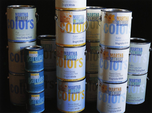
Description
Paint is only paint while it’s in the can and wet: as soon as you put it on the wall, it’s color. What we’re selling here is a color palette, colors that go with other colors. We’ve designed the labels to project the idea of color compatibility and versatility. Instead of calling it “Paints,” we’ve named it “Martha Stewart Everyday Colors.” The finishes on the different labels are meant to approximate the finish of the paint itself. The flat paint is wrapped with a flat label. The high-gloss paint is wrapped with a glossy label. Look at a typical paint department store: you see purple and turquoise and maroon metallic cans with a lot of foil stamping, antithetical to what’s in the can. We tried to present here a bright and positive and colorful array that approximates the color you can put on your wall.
Credits
- Design firm
- Drenttel Doyle Partners
- Creative director
- Stephen Doyle
- Graphic designers
- Rosemarie Turk, Tom Kluepfel
- Typefaces
- News Gothic, Franklin Gothic
- Printer
- Sherwin Williams Graphic Arts
- Papers
- 70# Kromekote, 70# Lustro Dull
- Clients
- Martha Stewart Omnimedia Ltd., Sherwin Williams