Fat Pig
Farrar, Straus and Giroux, New York, New York, 2004
Description
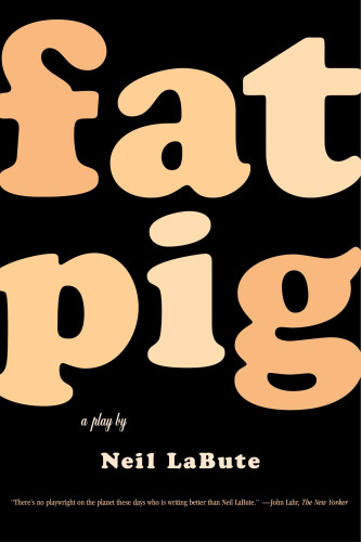
As book jacket designers, we always seek to make our covers stand apart from the sea of others on the shelves. Neil LaBute’s play Fat Pig needed to subtly taunt the viewer from across a room. My mission was to find a typeface that was as rotund as the character in the play. Cooper Black has a wonderfully curvaceous lowercase “g” with a descender that, when set in a fleshy color, reminds me of a stomach!
The cover design needed to make the most of its title. The play is about our weakness and tendency, often under pressure of our peers, to judge others by their appearance. I wanted people to laugh when they saw the cover, just as the characters in the play do when they first see Helen, the story’s “fat pig.” I wanted the audience to judge the book by its cover before they formed opinions (good or bad) about the play itself.
Credits
- Design firm
- Farrar, Straus and Giroux
- Art director
- Lynn Buckley
- Jacket designer
- Charlotte Strick
- Production director
- Tom Consiglio
- Production coordinator
- Michelle Crehan
- Author
- Neil LaBute (Playwright)
- Editor
- Denise Oswald
- Publisher
- Farrar, Straus and Giroux
- Trim size
- 5 1/2 x 8 1/4 inches
- Pages
- 105
- Quantity printed
- First printing, 3,500; second printing, 2,000
- Typeface
- Copper Black and Balmoral Script
- Jacket printer
- Jaguar Advanced Graphics
- Paper
- Matte film laminated