Norman Design identity
Norman Design, Chicago, Illinois, 2001
Description
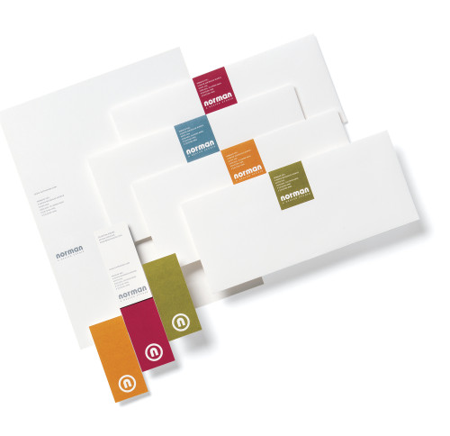
We at Norman Design wanted to revitalize our brand to better define who we are and what we do. The system is distributed to both clients and prospects. We emphasized our name, Norman, and added a tagline—A Design Studio—which is more descriptive and boutique-like in nature. We also developed an icon that can standalone and created a complementary typographic treatment. The four-ink palette enables the mixing and matching of components. The business cards stand out with their irregular shape, vertical orientation and two-sided printing. Letterpress provides a tactile experience.
Juror Notes
“Very consistent and imaginative. Expertly done.”
Collections:
AIGA 365: 23 (2002)
Repository:
Denver Art Museum
Discipline:
Brand and identity systems design
Format:
Stationery
Credits
- Design firm
- Norman Design
- Designer
- Armin Vit
- Typefaces
- Bauhaus (customized), Filosofia
- Printers
- Ladendorf Brothers, Rohner Letterpress
- Paper
- French Paper Smartwhite
- Client
- Norman Design
Loading...
Loading...