The Chicago Manual of Style, 16th edition
University of Chicago Press, Chicago, Illinois, 2010
Description
Project brief: The Chicago Manual of Style is the signature publication of the University of Chicago Press, with a legacy spanning more than 100 years. It is considered one of the top style guides in the publishing industry and is the only book we publish that elicits voluminous feedback from our readers—almost as much about the design as the content. The challenge was to remain sensitive to this audience while designing a jacket and book interior that signaled a shift from the past and embodied the current trends of the digital age.
Approach: I knew I wanted to make certain typographic changes to the 16th edition of the Chicago Manual of Style. For the 15th edition, I had abandoned the Times Roman of earlier editions for what I considered to be an elegant pairing of Scala and Scala Sans. This change in typeface was met with outrage (copy editors) and celebration (designers) in equal measure. I realized I had work to do if and when I designed the 16th edition.
In the end, I settled on a combination of FF Tisa (a low-contrast, slab serif) and Hoefler & Frere-Jones (HF&J) Whitney (a clean, sans serif companion). Though often considered a font for magazines, FF Tisa had undeniable appeal with its upright, hybrid italic, its large x-height, generous character set and beautiful, readable letterforms. H&FJ Whitney, which I used primarily for captions and tables, was a nice counterpoint to FF Tisa and is featured prominently in chapter five to highlight in-line examples. This enabled me to forego the use of a second color for the interior: lowering material costs and simplifying the manufacturing process.
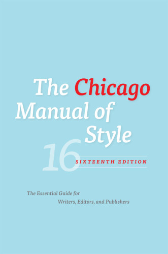
Although the publisher said early on that they wanted a new look for the jacket, a spirited debate ensued over whether to keep the signature orange jacket that had been a companion to the book for nearly 30 years. Ultimately, the publisher was persuaded to go with the custom blue of the current jacket, since I retained the signature orange for the jacket spine and back panel. I also used the custom binding cloth from the previous edition. The familiar orange peeks out from underneath the jacket and when the jacket is removed, a bright but subtle 16 sits on the front panel. The book’s endpapers match the blue of the jacket. With these design elements, users can easily identify the 16th edition from previous editions (an unofficial but passionate request from many of my editing colleagues).
Effectiveness: The publisher was pleased with the design of the book. This is a rare instance in which book reviews immediately confirmed that the design approach succeeded in one of its primary objectives: to signal a dramatic shift from the past in a manner that didn’t alienate the primary audience of the book. A few of the reviews follow here:
“On a visual note, the book has handsome, readable new fonts: FF Tisa, originally designed to be a magazine font, is the main text, while Whitney is used for in-line examples of grammar. (The 15th, whose main text is Scala, not only puts in-line examples in blue ink, it puts interlinear examples in Scala Sans, both of which seem awkward now in light of what the 16th CMoS gives us.)” —Design Observer blog
“This venerable bible also has a new pastel-blue book jacket to alert users to the style, usage and technology updates within, though the familiar orange cloth lies below. A worthy, welcome addition to every library collection as well as professional wordsmiths and educated readers of all persuasions.” —Library Journal
“And did you see that sleek, new, toothpaste-blue jacket? Farewell, older orange editions: this is a style guide for a new era!” —New Yorker Book Bench blog
“This iteration has a jacket the calming shade of a robin’s egg or one of those old Mac screens, and you can imagine a weary copy editor cooling her tired brow against it. It has about a hundred more pages than the 14th and a crisper font.” —Ed Park, Bookforum
I consider the design to be a success. It is a contemporary design that adheres to the typographic standards Chicago is known for. The book, though simple in its typographic presentation, creates an eye-catching, fresh, immediately identifiable package that, with the addition of “robin’s-egg blue,” has been embraced as the new look of the Manual.
Juror Notes
A refined type treatment for such a massive reference title. Bold use of the orange-cloth binding and lovely color palette for the jacket.
Credits
- Design firm
- University of Chicago Press
- Creative director
- Jill Shimabukuro
- Designer
- Jill Shimabukuro
- Jacket designer
- Jill Shimabukuro
- Production coordinator
- Christina Samuell
- Editor
- Carol Saller
- Publisher
- The University of Chicago Press
- Project manager
- David Morrow
- Compositor
- Graphic Composition, Inc.
- Jacket printer
- Lehigh Phoenix
- Manufacturer
- Edwards Brothers, Inc.