


Oakland Museum of California
Skidmore, Owings & Merrill, San Francisco, Oakland, California, 2010
Description
Project brief: The Oakland Museum of California (OMCA) sought a new graphic identity that would revitalize the organization’s culture and community image. This new graphic identity would convey change, appeal to a diverse target audience and help the organization to market itself in the competitive San Francisco Bay Area museum environment.
The new graphic identity became the foundation for a comprehensive environmental graphics, signage, wayfinding, and website rebranding program. In addition to reversing a long-standing image, the implementation of this graphic program needed to speak to the Museum’s existing historic context while also serving as a bridge for a contemporary architectural renovation project.
This “mind change” initiative was a challenge on multiple levels. The Museum’s original graphic identity emphasized the organization’s historic roots while the new identity needed to project a promising future. Secondly, the Museum’s landmark 1969 building posed challenges. Although architecturally significant, the building’s integration into the landscape, lack of clear signage, and numerous public-entry points made the structure easy to overlook and difficult to navigate.
Approach: The design team addressed the brief through a multi-phased approach. Through workshops and visioning sessions with the Museum board, staff, docents and visitors, the unique qualities of the new graphic identity emerged. The new mark, represented as a collection of letterforms, reflects the diversity of both the Museum’s collection and the community it serves. The selected orange is bright, warm and inviting—a color that truly represents the Golden State. As a secondary or “in between” color, orange conveys a sense of change. Furthermore, just as the Museum building highlights the interplay of indoor and outdoor space, the new mark integrates both positive and negative space and allows for flexible applications.
A main component in achieving street presence included the installation of a 20-foot-tall totem that announces the Museum at the corner of Oak and 10th Streets. Among the multiple entries, the totem clearly communicates the location of the main entrance to the Museum. This three-sided totem was conceived as a folded plane—a concept that is used throughout the larger environmental graphics program as well as the architectural renovation.
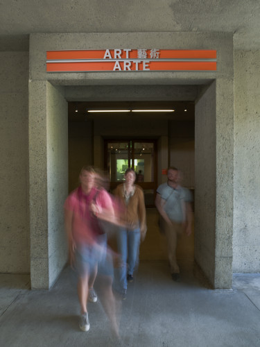
The free flow of circulation within the historic 1969 building obstructed wayfinding. Given that visitors enter and exit the Museum at every level, a logical system of signage and wayfinding was necessary to orient and direct guests. As a solution, the design team created a uniform signage system along an easy-to-follow trail through the Museum. The signage is composed of simple panels—white for directional information and the Museum’s orange for places of arrival—both of which are held within extruded channel frames that make use of the folded-plane design concept.
Re-envisioning the donor wall was one of the most important elements of the new environmental graphics program. Located on the central stair that connects all levels of the Museum, the donor wall animates and legitimizes a space that would have only been used for circulation. Composed of painted aluminum C channels in three shades of green, the donor wall is arranged across a concrete wall in an asymmetrical and porous pattern. The aluminum extrusions, another iteration of the folded-plane concept, alternate between facing toward and away from the building. When viewed in its entirety, the donor wall appears as an abstract representation of ivy, enlivening the concrete walls of the stair and referencing nearby gardens.
The donor wall was also an innovative solution in its use of off-the-shelf, extrusion-cut “bricks.” This relatively inexpensive material allowed the Museum to celebrate individuals for smaller contributions that would not have previously been recognized. Furthermore, the nonhierarchical organization of the donor wall showcases the collective contributions of the community rather than highlighting individual donors. As a modular system, the donor wall allows for future expansion as the Museum continues to attract new contributors.
Effectiveness: In the spring of 2010, this focused effort culminated in an unveiling of a reimagined facility that has been closely monitored by the larger museum community. The Museum has enjoyed higher visiting rates and greater appeal to San Francisco Bay Area museumgoers who would not have otherwise made the trip to Oakland. This attention also includes the recent publication by artist Mark Dion titled The Marvelous Museum. This book features the Oakland Museum as a case study in the discussion of the role of the museum in contemporary society.
“Well, the opening has come and gone and was a tremendous success!! I reflect back on all that you have done and how well you all worked together to make this happen. The long hours, the overall team work to solve any “bumps” in the road to achieve the end goal: a transformed museum. The Museum looks terrific and I know our visitors over the weekend were very, very impressed at how different and much improved the Museum looks and feels. I know that it took a tremendous last-minute push by everyone to get the last “finishing touches” in place. I thought your professionalism and dedication was, as expected, top notch, and the end product is as well.” —Lance Gyorfi, board of trustees, Oakland Museum of California
“Just want to add my thanks as well. From the beautiful new grand entry to the gorgeous new signage and way-finding to the beautiful finishes and craftsmanship in all of the spaces, everything looked absolutely terrific. And, best of all, on behalf of the staff, we couldn’t have had better partners with whom to work. You are all forevermore part of the OMCA family!” —Lori Fogarty, executive director, Oakland Museum of California
“The graphics are clean, precise and communicate a clear vision. The donor wall in particular fills that transition space well.” —Susan Chamberlin, Renovation Oversight Committee chair, Oakland Museum of California
“In addition to providing an exciting visual element and recognizing generous contributors, the donor-recognition system helped to generate an unanticipated level of enthusiasm from prospective donors to OMCA’s $63 million Museum of California Campaign, which renovated and expanded the Museum.” —Linda Larkin, associate director of development, Capital Campaign, Oakland Museum of California
Juror Notes
The vibrant color palette and materials in the way-finding system and donors-recognition wall bring life and energy to the existing concrete structure. The logo has a nice, arresting playfulness.
Credits
- Design firm
- Skidmore, Owings & Merrill, San Francisco
- Designers
- Lonny Israel, Alan Sinclair, Brad Thomas
- Photographers
- Tim Griffith, Thomas Heinser
- Architect
- Mark Cavagnero Associates
- Fabricator
- Thomas Swan Sign Company
- Client
- Oakland Museum of California