


When You Were Small
hundreds & thousands design inc., Vancouver, British Columbia, 2005
Description
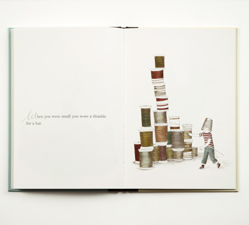
Both the text and illustrations for this children’s book were very simple and elegant. The intention behind the design was to be quietly playful, without overwhelming the content.
Color plays an important role in the design. It was delightful for me to work with the illustrations, because of their colors: aqua, olive, chartreuse, creamy yellow, mauve, denim blue, burnt orange and deep crimson. Combined, they created a handsome palette of tertiary colors, which I used sparingly throughout the book.
Each page of the text begins, “When you were small . . . ,” so we played with the repetitive uppercase W. The illustrator was commissioned to provide a number of ink drawings of Ws, which matched the illustrations. I used these in place of drop caps, a different W beginning each page.
Juror Notes
Nice marriage of text and art, as well as design decisions such as cloth spine and charming endpapers that add to the nostalgic package.
Credits
- Design firm
- hundreds & thousands design inc.
- Designer
- Robin Mitchell
- Illustrator
- Julie Morstad
- Author
- Sara O’Leary
- Typefaces
- Bell MT, supplemented with hand-drawn drop caps
- Printer
- AZ Grafiche
- Binding method
- Sewn/hardback
- Publisher/client
- Simply Read Books