Vernon Grant’s Mother Goose
Harry N. Abrams, Inc., New York, New York, 1998
Description
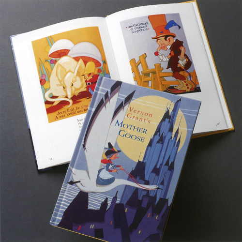
The design of this book is simple, yet witty, especially in the handling of the typography. Vernon Grant’s whimsical boldly colored illustrations made him “America’s favorite children’s artist,” according to Life magazine. Letters tumbling, lines zig-zagging, and words jumping were a natural outgrowth of his humorous caricatures. To move the eye sprightly from illustrations to rhymes, titles were eliminated in favor of bold type for the first line of the rhyme. The eye finally drops to the folios, which are bracketed by the slanted parallel lines that characteristically adorn Grant’s signature in the illustrations.
Collections:
50 Books | 50 Covers of 1998
Discipline:
Book design
Format:
Book
Credits
- Design firm
- Harry N. Abrams, Inc.
- Designer
- Darilyn Lowe Carnes
- Illustrator
- Vernon Grant
- Typeface
- Weiss
- Printer
- Canale Printing
- Publisher
- Harry N. Abrams, Inc.
Loading...
Loading...