


Interieurs
Paprika, Montreal, Quebec, 2008
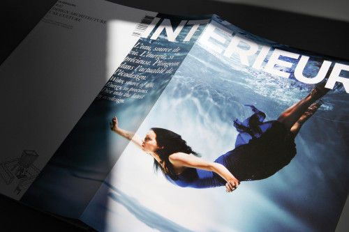
Description
Interieurs is a well—known Canadian publication, dedicated to design and architecture. Paprika was mandated to redesign the entire mock-up of the magazine and improve the presentation of the cover to reflect the artistic and design creativity within its pages. It was important to keep the actual subscribers and increase the readership with art, design and architecture lovers.
The new cover is mainly blank. You have to open the flap to access most of its usual content—the major visual as well as the brand identity of the magazine itself. This idea came in part from the name of the magazine, Interieurs (“interiors—). The cover doesn’t “end” after you flip it once; it becomes “alive,” and definitely invites you to sneak inside.
Juror Notes
Having the title wrap around the “interior” of the magazine is an effective and innovative solution. The use of generous “white space” on the cover allows visibility on the shelf. The clever use of a “slice” of photography on the cover also allows for a variety of photographic styles and still maintains consistency with the design.
The cropping of the title and imagery on this cover feels fresh. It literally leads you into the interior, hence the name.
Cover treatment with a vertical image crop creates drama that is atypical in this kind of publication. The interior spreads use type in ways that challenge convention but still remain grounded.
Credits
- Design firm
- Paprika
- Creative director
- Louis Gagnon
- Art director
- Francois Leclerc
- Editor
- Ginette Gadoury
- Printer
- Impresse Inc.
- Printing method
- Web
- Binding method
- Perfect
- Papers
- Gusto Satin, 80 lb., cover and text
- Typefaces
- Baskerville, Courier, Gotham
- Client
- Productions Interface Design