Identity, David Sanders
Paprika, Montreal, Quebec, 2004
Description
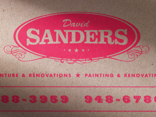
David Sanders, ENR is a professional firm specialized in painting and renovating houses. Because of the reputation of their employees, often qualified as “real artists” among its clients, the company works almost exclusively in very elegant areas of the city.
Even though clients’ recommendations to friends and family have provided the best promotion, the company needed to expand its activities. It needed a new identity to communicate their offer as well as to and promote its services.
When working on this new identity and stationery, we wanted the message to be strong: highly professional work that is not highly expensive. The logo itself is reassuring and speaks to clients in terms of long-time experience and refinement. But we selected a very basic bond paper to offset the costliness that this message could suggest. Knowing that clients hire painters to make their color selections most of the time, we also wanted to communicate a sense of creativity. This is why we played with 12 different colors of letterheads and envelopes, and used painting-samples for business cards.
Credits
- Design firm
- Paprika
- Creative director
- Louis Gagnon
- Art director/designer
- Sébastien Bisson
- Printer
- L.G. Chabot
- Printing method
- Offset, silkscreen (business cards only)
- Paper
- Rolland Rockland
- Client
- David Sanders


