Palo Alto
Miriam Rosenbloom, New York, New York, 2010
Description
Project brief: James Franco’s debut collection of short stories was an interesting book to design. He’s a big name in the film and art worlds but this is a collection of very strong stories that work on their own merit outside of this celebrity factor. We wanted something that looked “literary” and was also a striking physical object. As this was the original edition of the book, we were able to go quite “highbrow” in the look.
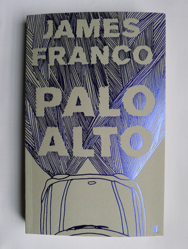
Approach: I, Miriam Rosenbloom, read all the stories and spent some time thinking about them. I wanted to find a way to get across the literary aspects of the stories, giving a sense of place and era without overplaying the potential celebrity angle of James Franco. I had worked on a previous limited-edition project that used uncoated paper stock and foil blocking in a cross-hatching pattern and it was an effect I really liked and wanted to explore further. I felt that the hand-drawn, slightly “doodling” lettering reflected the suburban teenage aspect of the stories, and cars also play a large role in the stories. These two ideas combined to create the illustration. I was lucky enough to also have a relatively simple approval process with a lot of enthusiasm coming from the in-house Faber team and the author about the cover concept.
I also liaised closely with Faber’s production department to keep the project within budget, using as many different printing techniques as we could. In the end we settled on a colored uncoated stock with colored foil and a black pantone. I felt that these kinds of finishes were more akin to what you find in art-book publishing than in trade publishing, which I also felt had a good, subtle association with Franco’s work.
Effectiveness: The printing effects worked really well on Palo Alto and the finished book looked really striking. The production values are higher than a lot of books in the same market and at the same price point, which I think gave the book an edge and really made it stand out in the bookshops. Readers and the Faber team also felt that the cover was true to the book’s contents, which is always a key consideration. Faber has decided to keep this cover (with a variation on the paper and foil colors) for the mass-market B-format edition later this year. This is a great indicator that the cover has been considered a success. The book has also been reprinted several times in its original format and sold more than 10,000 copies—a huge success for a debut collection of short stories.
Juror Notes
The hand-drawn illustration is a great representation of the teenage characters. The choice of paper stock and blue foil is a nice addition.
Credits
- Design firm
- Miriam Rosenbloom
- Designer
- Miriam Rosenbloom
- Illustrator
- Miriam Rosenbloom