


Paprika stationery
Paprika, Montreal, Quebec, 2005
Description
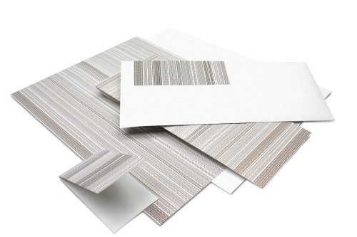
Paprika is a graphic design firm with a strong reputation in creating brand identities. This imposes especially high standards when it comes to creating a look of our own—knowing full well that our image will invite scrutiny from clients, suppliers and graphic arts professionals. We have created an extensive stationery system in which all information—name, address, telephone number and the rest—is treated as a visual pattern or theme. In the manner of an optical illusion, the positioning and repetition of this basic information creates a texture with the resulting image resembling a bar code.
Juror Notes
Modern, irreverent; breaks a lot of rules.
Doesn’t take itself too seriously.
Type design for type’s sake; doesn’t look to be “pretty.”
Not fuzzy—even through choice of materials.
So unadorned; so intentionally considered that it looks unconsidered.
Credits
- Design firm
- Paprika
- Creative director
- Louis Gagnon
- Art director
- Louis Gagnon
- Designer
- Richard Bélanger
- Printer
- L. G. Chabot
- Printing method
- Lithography
- Paper
- Pegasus
- Typeface
- Helvetica Neue
- Client
- Paprika