Everything Matters!
Isaac Tobin, Chicago, Illinois, 2010
Description
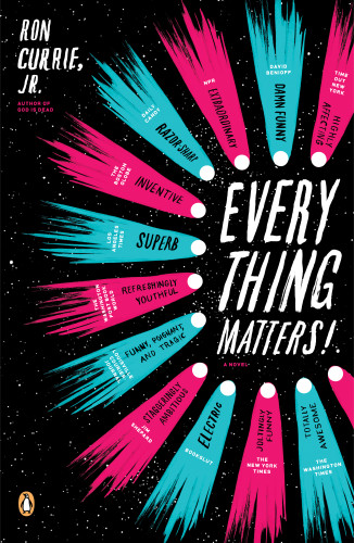
Project brief: The hardcover edition of this novel got great reviews but didn’t sell as well as expected, so Penguin wanted to try something different for the paperback. The novel is the coming-of-age story of a boy who was born with the knowledge that the Earth will be destroyed by a comet in 36 years. The tone is both funny and moving, and the story is filled with many different over-the-top subplots that somehow weave together to form a coherent whole. I really liked the novel and wanted to faithfully represent it in visual form and help it reach a wider audience.
Approach: As a university-press book designer, I only rarely get to design novels and was thrilled to be given this opportunity. My first batch of designs each picked up on a small moment from the book. Roseanne Serra, an art director at Penguin, thought the designs looked too much like nonfiction and that I needed to push further. So I started over and pushed myself to more abstractly capture the tone of the text and the writer’s voice. This second batch of designs was much better and was well received, but by then Penguin had come up with a new idea for me to try. They wanted to feature some of the great reviews the book had been getting, and Paul Buckley suggested putting all the quotes in a bunch of comets. I was sad to start over again but thought the idea would actually work well. I used a brush and some black ink to hand-letter all the blurbs and paint some comets.
Effectiveness: I’m very happy with the finished cover. I think it really captures the tone of the book, and I was glad to find out that the author agrees. He called it a “little slice of perfection” in Penguin 75. As a freelancer, I don’t know how the paperback edition has been selling but I have found references online to readers buying the book for the cover design alone. Many of these are on Tumblr blogs where multiple (presumably young) people have re-posted the cover art, further spreading word about the book, so I think it’s fair to say that the cover design has helped the book find new readers.
Juror Notes
The blurbs inside the comets are brilliantly integrated into the design. Clever use of hand-drawn type.
Credits
- Design firm
- Isaac Tobin
- Creative director
- Paul Buckley
- Art director
- Roseanne Serra
- Jacket designer
- Isaac Tobin
- Author
- Ron Currie, Jr.
- Trim size
- 5.5 x 8.5
- Typefaces
- Archer, Attleboro Wide Black (homemade), Gotham, hand-painted lettering