Berklee College of Music illustration
Peter Arkle, New York, New York, 2003
Description
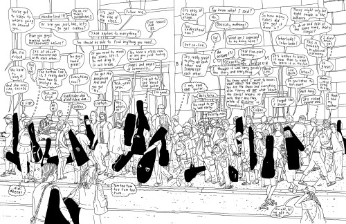
Berklee College of Music (via SiegelGale) asked me to produce a double spread for their new prospectus, showing Berklee student life in a realistic, informal, candid and down-to-earth way, making it a true reflection of the spirit of the college. The intent was to let prospective students glimpse a slice of life (and perhaps a bit of unexpected entertainment) between or beyond classes at Berklee and make them think: “Hey, Berklee looks like a cool place. I’d like to study there.”
In order to make this spread stand out from the rest of the prospectus (and for comic-book styling reasons) it was decided that this spread should be in black-and-white line.
I spent one day snooping around the college (with a student as a guide), making notes of things I heard students saying and taking lots of sneaky digital photos—immersing myself in student life as much as a gray-haired 35-year-old illustrator possibly can. I ended up focusing mainly on an area of the campus known as Berklee Beach, a popular place for students to hang out. Back at home, I made drawings and composed these with text from my notebook into the final image.
I hear (from the college) that current students reacted positively to the drawing. The reactions of prospective students haven’t yet been properly tested. However, the prospectus is being reprinted and my drawing isn’t being removed, so that must be a good sign.
In terms of budget, I was not involved in print production so I can’t comment on those costs. My expenses were minimal (a flight to Boston from New York which was paid for by the college, some lunch, lots of sheets of cheap photocopy paper—scraps recycled carefully—and some black ink). My fee for this fun experience was $2,000.
Juror Notes
This year it seems as if there is a tendency to choose projects that have words in them, or thought-balloons. This is true even if the words are symbols, are implied, or are conspicuously not there.
Love the use of words and word bubbles, great drawing, nice style.
Credits
- Design firm
- Peter Arkle
- Designer
- Chris Allen
- Illustrator
- Peter Arkle
- Writer
- Peter Arkle
- Printer
- Finlay Printing
- Typeface
- Handwritten
- Client
- Berklee College of Music