


Domison identity program
Paprika, Montreal, Quebec, 2008
Description
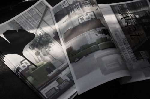
Domison is a furniture brand whose goal is to grant access to good design to everyone. They created a line of furniture that is sophisticated and classical. It is accessible, but still very well done.
For the logo, the client requested that we create something classical. We did little intervention on the typography; tweaking the Domison’s i while cutting its hair stroke. Then we added the leaf of a gingko, an old Chinese tree.
Once the logo was done, it became more of a “universe” than a logo. As the project “grew,” it became “organic,” with very few constraints. We treat the leaf and the name like graphic elements, creating patterns, playing with the logo. We make it move, change its angle, repeat it, etc. We play with juxtaposition, transparency, overlapping and duplication of elements.
This is an evolving concept. When creating a new piece, we pick something from the old, but we give ourselves the right to change it. This way, the program evolves and takes a direction that we couldn’t have planned at the beginning of the project.
Juror Notes
Integrates the brand into an environment in so many interesting ways. Endless textures; sense of discovery; poetic.
Credits
- Design firm
- Paprika
- Creative director
- Louis Gagnon
- Art director
- Rene Clement
- Client
- Domison