Holiday card, Cook+Fox Architects
Doyle Partners, New York, New York, 2004
Description
We were asked to create a holiday greeting for the architecture firm of Cook+Fox that reinforced and communicated their commitment to green architecture and building practices, as well as conveying the traditional wishes for a happy holiday and new year. The greeting was mailed to potential clients, existing clients, business associates and friends of the company.
Having worked extensively with Cook+Fox on presentation materials that explain and clarify some of the principles and details of sustainable architecture, we approached the holiday greeting with the same desire to educate and explain. We pulled back the curtain of security and secrecy that has traditionally obscured our understanding of what is really going on at the North Pole and elucidated a few specific details of environmentally friendly practices currently in use there. When the population is informed about policies of eco-friendly design and function and sustainability at the pole, it is much easier to embrace those ideas in our own latitudes.
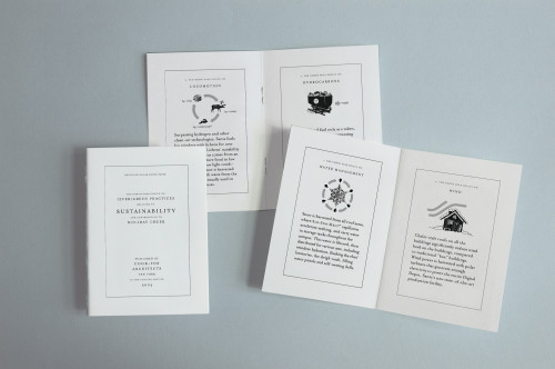
Using little paper and less ink, and creating less waste, our solution was a small “white paper,” photocopied in just black on recycled stock, highlighting six important areas where the North Pole is leading the way in sustainable building and environmental practices. Oh, and a rather significant parameter of the project was lack of natural resources (cash) for its production and distribution.
Our strategy that serious, environmentally aware architectural vigilantes would make a more memorable impact if they lightened up a little seems to have curried attention and appreciation in the hard-core-green sector. Cook+Fox is a leader among architectural firms in creating buildings that are elegant solutions to visual, spatial, community, sustainability, and environment issues. Their belief is that good design is sustainable design. Our solution in this small project among these enormous ideals succeeds using the same principles.
Credits
- Design firm
- Doyle Partners
- Creative director
- Stephen Doyle
- Illustrator/designer
- Martin Iselt
- Copywriter
- Stephen Doyle
- Printer
- High Resolution
- Printing method
- Xerox Docutec
- Binding method
- Saddle stitched
- Paper
- Xerox, Docutec White, 110 lb. text
- Typefaces
- Mrs. Eaves, News Gothic
- Client
- Cook+Fox Architects