


“Inspiration, Where Does It Come From?” 11/30/03
<em>The New York Times Magazine</em>, New York, New York, 2003
Description
This is the third annual issue on design, produced by the New York Times Magazine. The theme was inspiration, and it entailed an in-depth examination of where inspiration comes from in the design process. In the words of Arthur Lubow’s introduction, “We think of artists as following their muses and of designers as chasing the market. In reality, designers and artists aren’t separated by so sharp a line…. we think, tinker, reassess, just like artists.... the goal is to be open to an extraordinarily broad range of influences.”
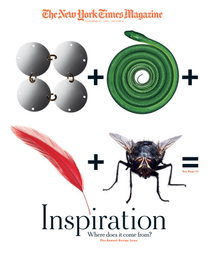
The design goal was for the issue to reflect those values. The page designs were built around the use of an unusual typeface called Bits, created by London-based designer Paul Elliman, and made up of the silhouettes of found materials like industrial debris, bottle tops, coffee cup lids and computer components. Elliman finds his bits everywhere, in industrial areas, along the sides of railroad tracks, and on the off-ramps of highways. These large cap initials are the anchoring element of the design for each opening story of the magazine, and there is an on-page description of the source of the letterform, to give the reader a deeper level of information. The page designs are structured in a simple, classic format, built to showcase the photography and the art. The cover was conceived as a simple mathematical equation for inspiration: four items (Paco Rabanne’s disc dress, the grain of snakeskin, the pattern of a fly’s eye, and layers of feathers) cited by the designer of Selfridges Department Store in London as inspiration for the structure and surface of his building. The cover directs you to the lead article of the issue, a visual investigation of the evolution of seven designs found intriguing by the team of Hjalti Karlsson and Jan Wilker (Karlssonwilker Inc.), hired by the magazine to explore the theme. The entire issue makes an effort to engage the viewer in a consideration of the value of design in contemporary culture in areas as diverse as fashion, politics and science, and to involve the reader in an exploration of the way inspiration functions in the hybrid world of design.
Juror Notes
Love the letters. The New York Time Magazine has a hardworking pace that caters to the business community. They didn’t pick a font for initial caps. They are great at arranging information at different levels, beautiful hierarchy of the type.
“You can change the perception of anything by the way it is displayed.” Robert Valentine
Credits
- Design firm
- <em>The New York Times Magazine</em>
- Art director
- Janet Froelich
- Designer
- Janet Froelich
- Photographer
- Mikako Koyama
- Picture editors
- Jody Quon, Kathy Ryan
- Cover photographer
- Mikako Koyama
- Editors
- Gerald Marzorati, Adam Moss
- Typefaces
- Bits, Cheltenham NYT, Stymie Extra Bold
- Client
- <em>The New York Times Magazine</em>