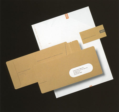
Skout Stationery
Skout, San Francisco, California, 1998
Description
Skout’s name suggests exploration and discovery. The stationery was designed to illustrate these concepts through both layout and construction. Instead of the typical #10, a unique envelope was designed to “package” the letterhead. Its construction offers the recipient a more tactile and therefore more memorable experience. Considerations such as perforated folds and printed salutation on the letterhead ensure a consistent look in an unconventional way.
Collections:
Communication Graphics: 20 (1999)
Discipline:
Brand and identity systems design
Format:
Stationery
Credits
- Design firm
- Skout
- Art director/designer
- Ed Anderson
- Typefaces
- Trade Gothic, Minion Expert
- Printer
- Logos Graphics
- Papers
- Champion Benefit, Fox River Rubicon
- Client
- Skout
Loading...
Loading...