


Carter’s
Wolff Olins, New York, New York, 2005
Description
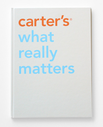
Carter’s is one of the largest wholesalers and retailers of children’s apparel in the United States. Wolff Olins developed a new brand strategy based on what really matters to moms. We also established a new logo, a fresh new brand color palette and a custom font. Wolff Olins moved the graphic style away from the industry standard, perfectly poised, overly coiffed princes and princesses to real, emotional photography of kids in action, with simple, childlike illustrations.
Juror Notes
So simple, beautiful and appropriate.
Nailed the audience.
Photography is beautiful, really tasteful.
Color palette is pushed enough that it’s not the expected.
Feels fresh, what you think the brand book should look like.
Children’s-storybook format is great.
Collections:
AIGA 365: 27 (2006)
Repository:
Denver Art Museum
Discipline:
Brand and identity systems design
Format:
Book, Brand and identity systems
Credits
- Design firm
- Wolff Olins
- Creative director
- Karl Heiselman
- Content strategist
- Samantha Wilson
- Client
- Carter’s
Loading...
Loading...