


EDP Identity
Sagmeister & Walsh, New York, New York, 2011
Description
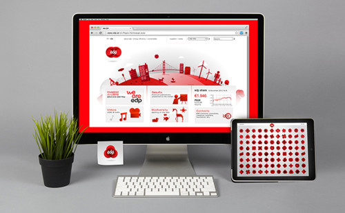
EDP’s old logo represented a smiling red mouth placed in a square. The smile was tired and off-kilter, but research showed that the company possessed considerable equity in the color red, being the only major brand in Portugal to use that color extensively. As EDP is a world leader—number one on the Dow Jones Sustainability Index when it comes to producing renewable energy—we did not have to take the usual energy rebranding route of depicting a green sun or a leafy tree. When you’re actually green, you don’t have to flaunt it.
Read the full case study with juror comments here: [http://www.aiga.org/case-study-edp-identity/]
Juror Notes
Getting people excited about a utility brand is a tough challenge given the relative unsexiness of the subject matter. The modular illustration system Jessica Walsh developed is both visually intriguing and emotionally uplifting, thereby creating a sense of excitement for people not typically engaged with energy and utilities. —Josh Rubin
Credits
- Design firm
- Sagmeister & Walsh
- Client
- EDP