Catalog, 2005–2006, Art Center
Matsumoto, Incorporated, New York, New York, 2004
Description
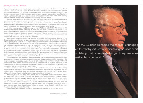
Art Center wanted to present a sophisticated image of the school, one that accurately portrays the quality of students it attracts and the quality of work produced by its students and graduates. The college is in the process of revamping its visual communications program, so this catalog had to make a big impact. It needed to be polished and sophisticated—a departure from recent catalogs.
The most important issue was that the design be sophisticated enough to communicate the quality of education the school provides. This led to the decision to make the book in a large size, to use multiple techniques (offset printing, embossing, die-cutting) on the cover to create immediate visual impact, and to use a heavy coated stock to enhance the quality of the color reproductions.
The goal was to convey the value of an Art Center education. By showing the work of a successful alumnus of each department, including a personal statement, the catalog gives potential students an idea of what kinds of careers are available with a degree from Art Center. It also shows current student works for each department, which highlight the quality of both the students and the instructors. The cover has an instant graphic impact, as it is embossed with fluorescent dots and has a die-cut circle in the center.
Credits
- Design firm
- Matsumoto, Incorporated
- Art director/creative director/designer
- Takaaki Matsumoto
- Photographer
- Steven A. Heller
- Production coordinator
- Amy Wilkins
- Production artist
- Dean Brierly
- Picture editor
- Dean Brierly
- Editor
- Dean Brierly
- Writer
- Dean Brierly
- Copywriter
- Alex Carswell
- Project manager
- Amy Wilkins
- Printer/binder
- Toppan Printing Company
- Printing method
- Offset
- Binding method
- Smythe sewn
- Paper
- Kinfuji Satin 150 gsm text
- Typeface
- Univers
- Client
- Art Center College of Design


