


Nagle, Ron
Cristina Hernández, New York, New York, 2010
Description
Project brief: Early discussions revolved around how to present the two parts of Ron Nagle’s life—music and art—in a cohesive story, make it visually interesting and let his distinctive personality come through. The project evolved into a representation of not just the work but also the person: Who made this stuff? The challenge was to capture Nagle’s personality in the design: how to portray his two sides and make the book equally appealing to both target audiences—his art and music fans.
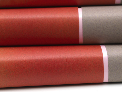
Approach: The dust jacket is minimal and formal but with a twist. It’s here that Nagle’s essence is represented, taking the traditional format in a new direction. The jacket emulates his artwork in a pared-down way, essentially a “riff” on a recurring motif in Nagle’s work: the subtle gradient interrupted by a thin, solid-colored stripe. Upon further inspection, the viewer unfolds the jacket and discovers its “B side”—a humorous portrait of Nagle as one of his favorite heroes, Charlie Chan—a nod to pop culture and his music career, which reveals another aspect of Nagle’s work and sense of humor. The two sides of the cover are signifiers of Nagle’s quirky personality. The first contact with the book shows the viewer that there is something else to discover, something more to consider.
Effectiveness: Traditionally, books published on ceramic artists have an “arts and crafts” look. The buzz within the art world is that “ceramics have always been at the back of the art bus,” says Robert Arneson. This book “breaks the mold,” says publisher Ted Rowland. “The elegant, clean design puts [ceramics/Nagle’s work] on par with other disciplines.”
Nagle agrees: “Clay has been marginalized, the stepchild of the real art world. This book’s design and approach is about a total creative process, a way of thinking with all its idiosyncrasies.” He hopes the book will help his work “cross over into the bigger art world and get out of the clay ghetto. It speaks to a larger audience.” About the cover, Nagle says, “I love the non sequitur, love the curveball; it’s the way I make stuff.”
From a design perspective, this book captures all of Nagle’s seemingly disparate oeuvre and aims to represent the man behind the work and his various sides.
Juror Notes
The unique folds and use of color reinvent the book cover as sculpture.
Credits
- Design firm
- Cristina Hernández
- Art director
- Cristina Hernández Villalón
- Designer
- Cristina Hernández Villalón
- Jacket designer
- Cristina Hernández Villalón
- Photographer
- Don Tuttle
- Production director
- Cristina Hernández Villalón
- Production coordinator
- Cristina Hernández Villalón
- Production artist
- Cristina Hernández Villalón
- Authors
- Dave Hickey, Jana Martin, David Pagel, Joel Selvin
- Editor
- Jana Martin
- Publisher
- Silver Gate, Inc.
- Trim size
- 9 x 11.25
- Pages
- 232
- Quantity printed
- 5,000
- Typefaces
- Chaparral Pro, Meta Pro, Trade Gothic
- Printer
- Oceanic Graphic Printing
- Jacket printer
- Oceanic Graphic Printing