


Red Papers
Ogilvy & Mather, Chicago, Chicago, Illinois, 2010
Description
Project brief: Miles Young, chief executive officer of Ogilvy & Mather Worldwide, tasked Ogilvy Chicago to design a series of journals written by the most forward-thinking experts to be shared with the thought leadership of Ogilvy & Mather Worldwide. Topics range from the digital frontier to consumer evolution/socialization to technological trends and predictions to the future of environmental responsibilities. These exclusive publications are only available by invitation to Ogilvy & Mather Worldwide creative summits. Miles is interested in inspiring future thinking within the agency through these limited-edition journals. The journal layout creates tension between classical and nontraditional formalities. These design decisions are meant to invite and challenge a conservative audience to think of the topic in a new and progressive way. This series not only demonstrates Ogilvy’s commitment to a global dialogue and exchange of progressive content and information but also furthers Ogilvy’s reputation as a worldwide company of big ideas.
Approach: We were given a matter of weeks to complete the first book for a creative summit held in Turkey. A creative director and senior art director were selected to handle the initial dialogue between Miles Young and Khai Meng (Ogilvy & Mather Worldwide creative director and chairman Worldwide Creative Council) to best understand their needs and intent.
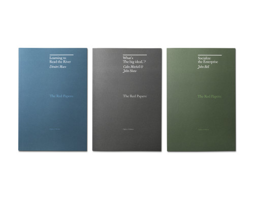
The red-paper journals address future thinking to an elite group of Ogilvy leadership around the globe. The progressive quality of information is masked behind a nontraditional interpretation of classic grid structures and proportions (e.g. asymmetry instead of symmetry, challenging the grid rather than conforming to it, and creating air and pauses that allow the content to breathe). We decided that illustration, rather than photography, is the best way to demonstrate complex and abstract concepts and to engage readers’ imaginations, as are the non-red covers. Since the content is largely new and undiscovered, we wanted the “red papers” covers to be anything but obvious or expected.
Effectiveness: The red papers journals are in constant demand. Due to the limited-edition nature of this project, we take this demand as a testament to its success. The quality of the information helped drive the decision to make this artifact a printed piece. We wanted people to hold it, feel it, be intimate with the content. The carefully thoughtful design is meant to inspire the audience to value each issue and look forward to collecting the next one. The form factor is meant to be simple and unpresumptuous (no fancy die-cutting, varnishing or inks). These books should be something that can easily fit into a briefcase or purse to take with you and refer to for ideas and inspiration. The red-paper journals have gone a long way toward rallying internal leadership, which in turn excites Ogilvy’s global network. But the halo effect is to bring “thought leadership” to our clients as well. It’s important for them to understand that despite Ogilvy’s illustrious past, today’s Ogilvy & Mather is dedicated to global progressive thinking in multiple areas of value and interest. We understand that there are greater cultural responsibilities beyond sales and profit. The red-paper journals demonstrate this commitment.
Juror Notes
Great agency resource that goes beyond being self-serving. Illustrations and dialogue make it accessible. Transformation of dialogue into keepsake.
Credits
- Design firm
- Ogilvy & Mather, Chicago
- Creative director
- Gabe Usadel
- Designer
- Alex Fuller
- Client
- Ogilvy & Mather