


Letter-Dropping
Braley Design, Brooklyn, San Francisco, California, 2010
Description
Project brief: The client had decided to relocate to San Francisco from Minneapolis to further increase his visibility as a freelance copywriter. To coincide with the move, the client wanted to take the opportunity to uniquely position himself as “independent,” thereby completely differentiating his name from all the additional freelance copywriters he’d be competing with in another major market. The target audiences were award-winning design studios, advertising agencies and interactive shops along with creative-competition jurors. Success metrics included a desired income increase from 2010, securing projects from a personal shortlist of select San Francisco clients and hopefully garnering recognition from a few awards shows (including AIGA 365) he’s yet to win. The turnaround time was less than a month and during the winter holidays in order to be eligible and ready for 2011 competition deadlines. Specific challenges included sacrificing a sixth color (magenta) so printing costs wouldn’t double, a half-dozen rounds of last-second revisions and hard-copy proofing delays because of “Snowmageddon.”
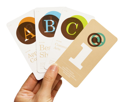
Approach: Addressing the brief was a true collaborative approach, as the client came to me with general ideas for both the logo and business card. It was mutually surmised that “name-dropping” was a necessary evil freelancers faced every time when asked what they’ve been up to lately. And since my client has never been shy about sharing recent resume highlights, we decided that “letter-dropping” in the form of flashcards would be a fun, tongue-in-cheek way to convey such. Cards were individually distributed via mail inside vellum envelopes along with entire packs given to select prospects in person. Mohawk 160-pound cover and New Century Schoolbook were chosen to best re-create the look and feel of authentic alphabet flashcards.
Effectiveness: The client considers the project a complete financial success, as he is currently on pace to almost double last year’s revenue, and has already experienced a return on investment of 1,000 percent. This is due in large part to soliciting projects from desired San Francisco clientele such as AKQA, Apple Computer, Emotive Brand and Hatch Design/JAQK Cellars, along with the likes of Anthropologie (BHLDN.com), JWT/Team Detroit (Ford Escape) and Team One Advertising (Lexus). I consider it a success because of the client’s complimentary observation that it “took him five years to reach A-list freelance status in Minneapolis but only five weeks to do the same in San Francisco thanks to the two-dozen-plus messages boldly announcing his arrival and backing it up with beautiful design.”
Juror Notes
Cheeky, irreverent and according to the brief—opened door.
Credits
- Design firm
- Braley Design, Brooklyn
- Creative director
- Michael Braley
- Art directors
- Michael Braley, Colin Corcoran
- Designer
- Michael Braley
- Writer
- Colin Corcoran
- Printer
- Panoramic Press
- Client
- Colin Corcoran