


Commercial Type Website
Rumors, Brooklyn, New York, 2009
Description
Commercialtype.com is the storefront, the public face and the promotional outreach for Commercial Type, a new type foundry.
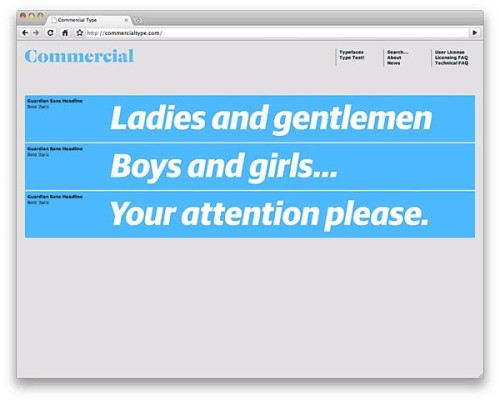
Commercial Type was founded by Paul Barnes and Christian Schwartz, who have collaborated since 2004 on various typeface projects, most notably the award-winning Guardian Egyptian typeface. Working closely with Paul and Christian, we helped organize the online store; ensured that browsing, testing and buying were easy and intuitive for users; designed the visual interface; and created an online type specimen system that showcases their typefaces.
The site is for designers, typographers, art directors and creative directors—anyone interested in browsing or purchasing typefaces. The foundry sells fonts in packages and à la carte. For example, one could buy all 18 styles of Graphik as a family or just buy only the Graphik Semibold Italic. Many customers will purchase a single style to try it and then return to purchase (or upgrade to) a complete family.
Creating the site presented many challenges, one of which was unique to this project: the development of a store showcasing on-screen typefaces intended to be used in print. We also wanted to give customers as much access to the typefaces as possible without exposing the files to theft.
While the store offers numerous buying options and packages, we wanted the shopping experience to be as transparent as possible. Fonts can be purchased as individual styles or in families or collections, and each file requires a license corresponding to the number of workstations where the font will be available. Furthermore, each screen featured multiple weights, styles and typefaces. Allowing the user to navigate intuitively required an airtight information hierarchy and formal structure.
Juror Notes
The site for Commercial Type is well executed, with thoughtful interface grace notes. It also reminds us of Letraset Æ (press-down lettering) catalogues, celebrating our professional heritage.
Credits
- Design firm
- Rumors
- Creative directors
- Paul Barnes, Christian Schwartz
- Designer
- Abi Huynh (homepage and PDF specimens)
- Developer
- Branimir Vasilic
- Programmers
- Tal Leming, Erik van Blokland (letter setters)
- Client
- Commercial Type Foundry