


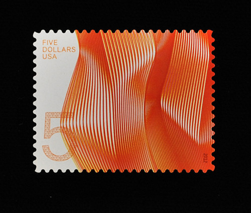
Waves of Color (high-denomination postage stamps)
Antonio Alcalá, Alexandria, Virginia, 2012
Description
The goals of this project were determined by the United States Postal Service (USPS). They asked for the following:
-A new $2 stamp design to replace a 15-year-old design that depicted a bobcat.
-A design that might take advantage of more ink colors and printing methods than is usually available for stamp issues.
-A design that somehow reflects the stamp’s status as a higher-than-usual denomination.
The audience for this project was all United States Postal Service customers. Although the high-denomination product would be used most often by businesses shipping small packages, it was one component of a larger stamp program, serving as part of the United States of America’s brand both domestically and internationally. Therefore, it had a much larger intended audience.
Read the full case study with juror comments here: [http://www.aiga.org/case-study-waves-of-color/]
Juror Notes
National attitudes toward art and design are reflected in a country’s currency and postage stamps, which are also a form of currency. U.S. currency currently embodies our worst national dysfunctions, to the point that I am almost embarrassed to carry cash. Our stamps aren’t far behind. This high-denomination series is a stunning exception. Necessarily complex in form but elegantly simple in execution, these designs are abstract yet absorbingly contemplative, suggesting that we may yet be a graceful, modern nation. —Christopher Simmons
Credits
- Art director
- Antonio Alcalá
- Client
- United States Postal Service