


Destiny user interface
Bungie, Bellevue, Washington, 2014
Description
After 10 years developing the ‘’Halo’’ games exclusively for Xbox, we were tasked to create a UI for a new game, ‘’Destiny’’. For the first time ever, we needed to ship a title simultaneously on four major platforms. The interface had to support a dense investment system, social gathering and matching, a large number of 3D assets, and seven languages.
When people think of sci-fi interfaces they think of cool hues and noisy bits of tech. We took a less expected route and leaned on Swiss typefaces, minimal footprint, and clean form factors. To accentuate the story’s fantasy aspects, we gave the map a look reminiscent of old mariner cartography. The disparity between the two styles is harmonized as subtle facets of each approach permeate each other throughout the game.
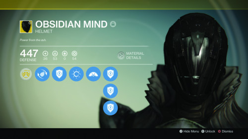
While common on PC, console games rarely employ cursors. Utilizing a cursor allowed us to hide data on tooltips to free up screen real estate, eased the browsing of dense inventories, and allowed our 3D assets to visually impact the user.
Throughout development we had regular trials of the interface with UX studies and our solutions tested very well. The gaming press wrote articles on the UI, which was unprecedented, and one journalist went so far as to call it, “the best part of ‘’Destiny’’.”
Read the full case study with juror comments here: [http://www.aiga.org/cased-2015-winner-destiny-user-interface]
Juror Notes
“As the mother of a 10-year-old, I find it delightfully refreshing to see a game interface with attention to nuanced typography and sophisticated design detail. Hallelujah.” —Sara Frisk