Olivier
Henry Holt and Company, New York, New York, 2005
Description
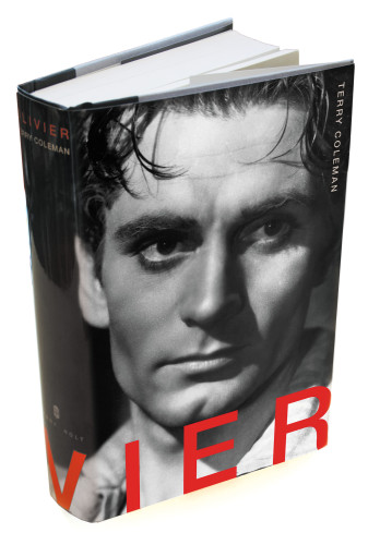
Olivier’s face was so iconic—and beautiful—I wanted to let it stand alone on this jacket. If I could have, I would have eliminated all the type completely. His face is all you need to tell you what the book is about, to sell the book. Of course the marketing and sales people at my company felt a little differently, and I knew the author would want to see his name featured somewhere on the jacket, so I tried to impose the type on the image of the face as seamlessly as possible. I decided to let the title type start on the back of the book and bleed over to the spine and front because it occurred to me that Olivier’s name, like his face, was larger than life. In a way it seemed too big to shrink down to fit on a mere 6-by-9 format. It seemed to call for something different, something more like a marquee. After I finished designing the jacket, I realized that all I had done was put Olivier’s face and name on a big screen again, where it belongs.
Juror Notes
Evocative photograph. The wraparound type works brilliantly here, leaving us with only the “IER” (ee-ay) that is the most identifiable part of his name. The contrast of matte and gloss laminates adds to the power of the figure.
Credits
- Design firm
- Henry Holt and Company
- Creative director
- Raquel Jaramillo
- Jacket designer
- Raquel Jaramillo
- Photographer
- Kobal Archives
- Production director
- Tom Nau
- Author
- Terry Coleman
- Editor
- Jennifer Barth
- Trim size
- 6.125 x 9.25 inches
- Pages
- 608
- Quantity printed
- 22,500
- Typeface
- Helvetica Neue
- Jacket printer
- Lehigh Press
- Paper
- 100 lb. C/1/S, gloss layflat and press matte
- Publisher/client
- Henry Holt and Company

