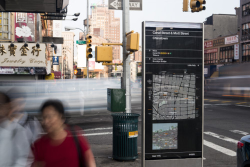
WalkNYC Pedestrian Wayfinding
PentaCityGroup, New York, New York, 2013
Description
WalkNYC is a new program of pedestrian maps introduced by the New York City Department of Transportation that makes it easier to navigate the city streets. Placed on a system of dedicated kiosks throughout the city, the maps are designed to encourage people to walk, bike and use public transit, and help guide them to major landmarks and subway and bus stations. The kiosks present two maps, one of local streets and the other of the area in relation to a larger section of the city.
The maps use an innovative “heads up” orientation in which the compass directions (north, south, east or west) are rotated to correspond with the direction the user is facing. The maps were developed in collaboration with a consortium of designers who worked closely with DOT, the city’s local Business Improvement Districts and other institutions and agencies. The design was extensively tested with pedestrians, who found it easy to use. The graphic language utilizes a customized version of Helvetica called Helvetica DOT and features iconic New York landmarks rendered as detailed, evocative line drawings. The brief included the WalkNYC identity, which is used to endorse any maps that use the graphics as official city maps.
Read the full case study with juror comments here: [http://www.aiga.org/case-study-walknyc-pedestrian-wayfinding/]
Juror Notes
“There’s something beautiful and refreshing about superbly executed way-finding systems. I, for one, believe these types of assignments are as hard to solve as complex technology problems. This system succeeds because the information is beautifully art directed, carefully presented and appropriately articulated.” —Dana Arnett
Credits
- Design firm
- PentaCityGroup
- Client
- New York City Department of Transportation


